Here's something nobody talks about in the "how to grow your audience" conversation: most tutorial content fails not because it covers the wrong topic, but because it's physically exhausting to follow. A six-part thread where every screenshot is a full desktop dump with the relevant bit somewhere in the middle. A YouTube video where the creator keeps saying "click here" while the cursor drifts vaguely across the screen. A blog post with eight steps, all using the same untouched screenshot. The content is technically correct. The reader still bounces.
In 2026, tutorial content is one of the highest-performing formats on X, YouTube Shorts, and LinkedIn — but the bar for "good enough to share" has moved. People don't just want to learn something. They want to learn it fast, without having to work to figure out what they're looking at. The creators who understand that are building audiences. The ones still screenshotting raw are not.
"The creators who understand that are the ones building audiences right now."
The Real Problem With Most Tutorial Screenshots
Take a screenshot of any software right now. Paste it into a document. Ask yourself: if someone who has never seen this tool opened this image, how long before they understand what they're supposed to do?
For most screenshots, the answer is somewhere between "a while" and "they'd probably give up." The interface is there. The step is technically visible. But nothing tells the eye where to go first.
Professionals working in design or documentation have always known this — you annotate, you number, you crop tight. The problem is that most creators are not designers, and doing this manually in Figma or Photoshop for every single screenshot in a 10-step tutorial is enough friction to make you just... not do it.
The gap between "I know I should annotate these" and "I actually annotated these" is where most tutorial content dies.
What Changes When You Build a Proper Screenshot Workflow
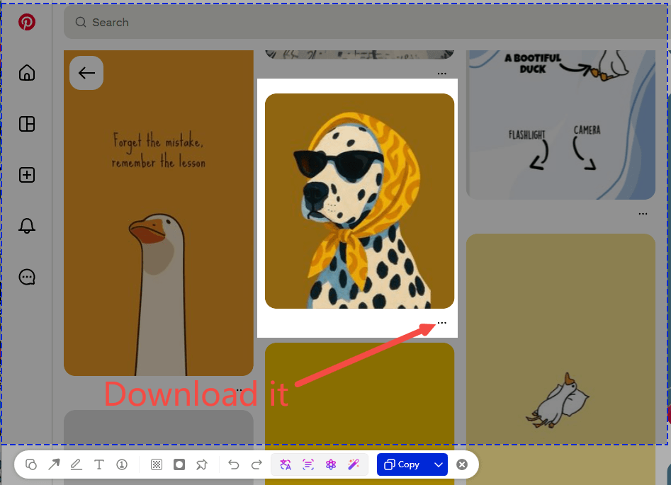
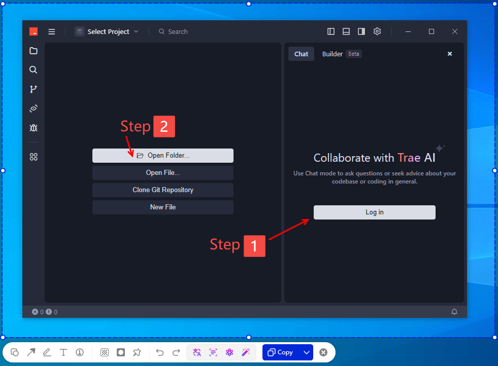
The creators I pay attention to — the ones whose threads I save and whose videos I actually finish — almost all do the same few things. They crop tight to what matters. They mark steps visually with numbers so your eye knows the order before you read a word. When something is moving, they show it moving. And they're fast enough at all of this that it doesn't become a separate project every time they want to post something.
That last part is the thing. Speed is what determines whether this actually becomes a habit or stays aspirational. If annotating screenshots takes you twenty minutes per post, you'll do it once or twice and go back to raw captures. If it takes two minutes, it becomes automatic.
This is where the right tool matters more than most creators realize. I've been using ChillShot AI for this, and the features that changed my output aren't the flashy ones — they're the boring operational ones: numeric step labels you click to place (not draw), a scrolling capture that grabs an entire flow in one image, a GIF recorder that exports without a separate step, hotkeys so the whole sequence runs off one keypress. None of that sounds exciting. The point is that I can go from idea to finished, annotated tutorial image in about three minutes — and that's the number that determines whether this becomes a habit or stays something you mean to do.
Workflow tipUse the blur tool before publishing — not just for passwords, but for anything in your interface that could distract from the step you're showing. A clean, focused screenshot communicates faster than a complete one.
The GIF Problem (And Why It Matters More Than You Think)
There's a specific kind of tutorial frustration that everyone who makes content has felt: you're trying to show something that only makes sense in motion — a hover state, a drag interaction, a UI animation — and a static screenshot just cannot do it.
The old solution was to record a video clip and upload it. Which works, but it's slow, and short video clips on X and LinkedIn don't always play the way you expect, and now you've added an encoding step to your workflow. A lot of creators just skip it and use a static screenshot anyway, even knowing it's worse.
A GIF solves this because it loops automatically, requires no play button, loads fast, and embeds everywhere. The problem has always been making them — traditional GIF workflows involve screen recorders, export settings, palette optimization, file size management. It's a whole thing.
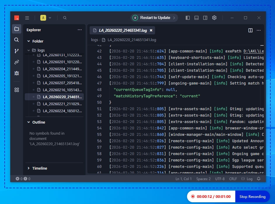
ChillShot's GIF mode cuts all of that out. You select the region, hit record, stop when you're done, and it's exported. No settings to tweak. The file sizes are reasonable by default. For a five-second interaction demo, you're looking at maybe ninety seconds of total time including the recording. That's actually usable.
Once you start putting GIFs into tutorials where they belong — UI walkthroughs, settings screens, anything with a sequence of interactions — you notice pretty quickly that readers spend more time on them. Movement holds attention in a way static images don't, and when that movement is directly demonstrating the thing you're trying to teach, it actually reduces the amount of text you need to write around it.
A Repeatable Format That Works
After making a lot of these, the format that gets the most engagement consistently is straightforward enough that it's worth writing down:
- Open with the outcome, not the context. Show what the finished result looks like before you show the steps. A GIF of the final working state gives people a reason to keep reading before they've invested any effort.
- Crop every screenshot to the relevant region. If the step involves a button in the top-right corner, the screenshot should show the top-right corner — not the entire application window. Scrolling capture is useful here for anything that spans multiple screens.
- Number the steps in the image, not just in the text. Readers scan images before they read captions. If the step number is visible inside the screenshot, they know where they are before they've read a word. Built-in number markers make this take about three clicks per image.
- Use a GIF for anything that involves motion or sequence. Dropdown menus, drag interactions, toggle animations, multi-step UI flows — anything where the movement itself is the instruction. Static screenshots for everything else.
- Blur anything that isn't the point. Notification badges, email addresses visible in the background, personal data on your desktop — if it doesn't add to the tutorial, blur it. Cleaner images read faster and look more professional.
That's the whole format. It sounds obvious once you list it out, but the reason most tutorial content doesn't do this is that each step used to require a different tool, or a lot of manual work in one tool. When all of it lives in the same application and runs off shortcuts, you actually do it.
The Honest Bottom Line
The creator economy is crowded enough now that the quality bar for keeping someone's attention has moved. People aren't short of tutorials — they're short of tutorials that respect their time. The ones that do show up in feeds, get bookmarked, get shared with the "you have to see this" preamble.
A better screenshot workflow isn't a magic fix for reach or growth. But it removes one of the most common reasons good content gets ignored: it was technically correct and visually exhausting. That's a fixable problem, and the tools to fix it are cheap enough that there's no real excuse to not fix it.
ChillShot AI is $9.99 as a one-time purchase. If you make tutorial content more than twice a month and you're still screenshotting raw, that's probably the most cost-efficient upgrade you can make to your workflow this year.